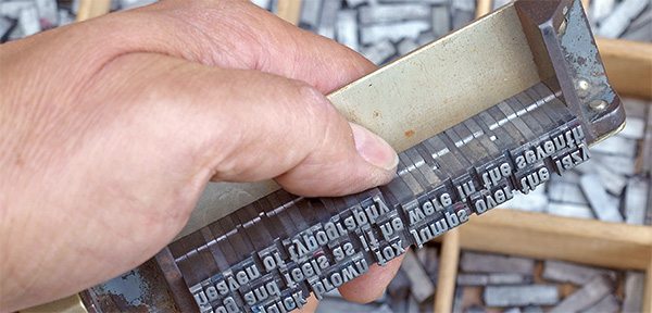
Deciding on what font to use for your marketing material hasn’t always been as easy as selecting the down arrow and scrolling through a seemingly endless list of various fonts. No. In fact, not that long ago it was common place where all the fonts that you could use were actually found on individual metal type blocks set within a box – making for a heavy combination. Each time you wanted to decide on what font to use, you’d have to lug out those heavy boxes and slowly piece together your words to decide if that particular font was what you wanted.
Sounds fun, right?
Luckily today with these amazing computers we have those metal boxes are no more and we get to pick from that endless list of funny named fonts. While the lugging of those heavy boxes has taken some of the headache out of choosing a font, we’re now inundated with more fonts than ever before. Deciding on which to use from these numerous options can be just as difficult as it was years ago.
Hopefully this guide will offer you a path to deciding, without much headache, on what font best suits your needs of the particular project you’re working on. We’ll cover the different categories of fonts, how to choose the right one, and how to use it. At the end of the guide there is a free gift for you, so make sure to make it to the bottom.
What are the different types of fonts?
You’d be surprised, just like I initially was, at how many different kinds of fonts there actually are. The two more common, Serif and Sans-Serif, are only a small fraction of the different categories of fonts available. There are in fact, depending on who you talk with, about 6 different font families.
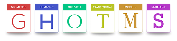
Scroll through the different types of font below to learn a bit about them.
Examples of Geometric Sans: Helvetica, Univers, Futura, Avant Garde, Akzidenz Grotesk, Franklin Gothic and Gotham
Examples of Humanist Sans: Gill Sans, Frutiger, Myriad, Optima, Verdana
Examples of Old Style: Jenson, Bembo, Palatino, and Garamond
Examples of Transitional Serif: Times New Roman, Baskerville
Examples of Modern Style: Bodoni, Didot
Examples of Slab Serifs: Clarendon, Rockwell, Courier, Lubalin Graph, Archer
Choosing Your Font
Your number 1 goal for selecting the correct font for your project is to make sure that it matches the message you want to portray. If you’re going for a professional look and feel for your project, don’t choose a childish looking font. Before looking through the millions of fonts available, think about what you want to portray. Think of the qualities and characteristics you want your design to communicate.
Making time for this thinking activity before diving into the world of fonts will save you a ton of time; not only in searching but in creating and proofing of your project.
Once you have decided on what kind of message you want the font to portray, it is time to start looking. When browsing fonts, it can be easy to get caught up in all the fun and interesting choices, but don’t let personal preferences get in the way; a font you think is distinctive or stylish may not be useful or appropriate for the project you’re working on.
If you’re finding your mind wandering and getting of track, just ask yourself this simple question: “Does this font support the qualities of my brand or complement the purpose of my design?” If the answer is a “No.” then move on to a different font. This easy question will keep you on track to finding that perfect font.
Consider Context and Audience
All fonts perform different based on how they’re being used. For instance – a business card design will need a font that’s easily readable at a small size. Or a website will require a font that be read well on a screen. While you may love the look of a particular font, keep in mind how you’ll be using it and make sure it will be readable.
Who is viewing your design may also be important. Is your audience of a certain age or demographic? Will your font choice resonate with them?
Your Free Gift
As promised, here is your free gift! Three great sites that have thousands of free fonts to use!
Font Squirrel
Google Fonts
DaFont