There are many ways to advertise your business, but one of the best is by using a vinyl banner. With their extremely high eye-catching nature and hard-to-miss look, people are easily pulled towards them. An added benefits of using a vinyl banner is that they aren’t used all too often every day, so when one is present it is unique enough for everyone to notice it.
If you decided to get your own vinyl banner for your business, but are having trouble decided how to design it, here are some tips covering color that will give you a jump start.
Make It You
Above all else when designing a banner, you need it to be apparent right away that this banner is about you and your business. The easiest way of doing that is by adding in your company’s colors to the banner. If you’re going to be adding your company logo, then selecting a group of complimentary colors that will enhance your logo is a must.
When designing your banner make sure to take notice of what your competition has done in the past. The last thing you want to do is create a beautiful banner design then learn that your competitor has already used something almost exactly like it. Make sure to stay away from similar color schemes that you competitors have used before or combinations that reminds people of a competitor’s logo.
Design Is Key
Above all else the banner needs to be readable and easy to look at. A person’s brain processes big words and simple color blocking easiest, resulting in a more pleasurable feeling; so play into that. Keep it simple. Focus on one focal point within the banner and use color, text, and other imagery to lead a person’s eyes to your logo, business name, or special.
The colors need to avoid distracting the reader from the content of the banner. While the colors should grab somebody’s attention, they shouldn’t cause a car accident if it’s hanging by a street light. It should be easy to comprehend and recognize, even from a distance. Give people something to remember you by.
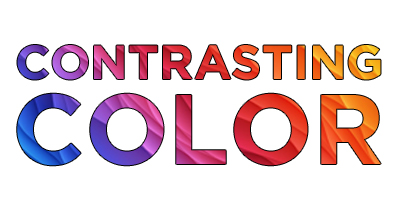
Contrasting Colors are the Way to Go
Colors that contrast are always a good option when advertising because it gives it a pop. McDonald’s is a prime example with their contrasting yellow and red sign. It’s an easy color combination to recognize. Blue and white is another common contrasting combination used.
These colors not only catch people’s attention but are aesthetically pleasing.
Bright colors are great but they can be distracting if you aren’t careful. This goes back to design and how colors affect the rest of the elements of your banner. Solid backgrounds go well with white lettering and vice versa. This is always a safe bet for your vinyl banner. A neutral with a bright color works really well too in most cases.
Hopefully you’re ready to create the perfect banner for your business. This is a great time to make creative decisions that separate your company from others. Help yourself get ahead of the game by making a name for yourself with this great advertising method. You’re on your way to elevating your organization with this vinyl banner. Once you have created your design give us a call and we’ll work with you on getting your banner printed.
Fill in the boxes to receive a free gift!
Download 4 templates for a variety of banner sizes that are perfect for any business.
Error: Contact form not found.